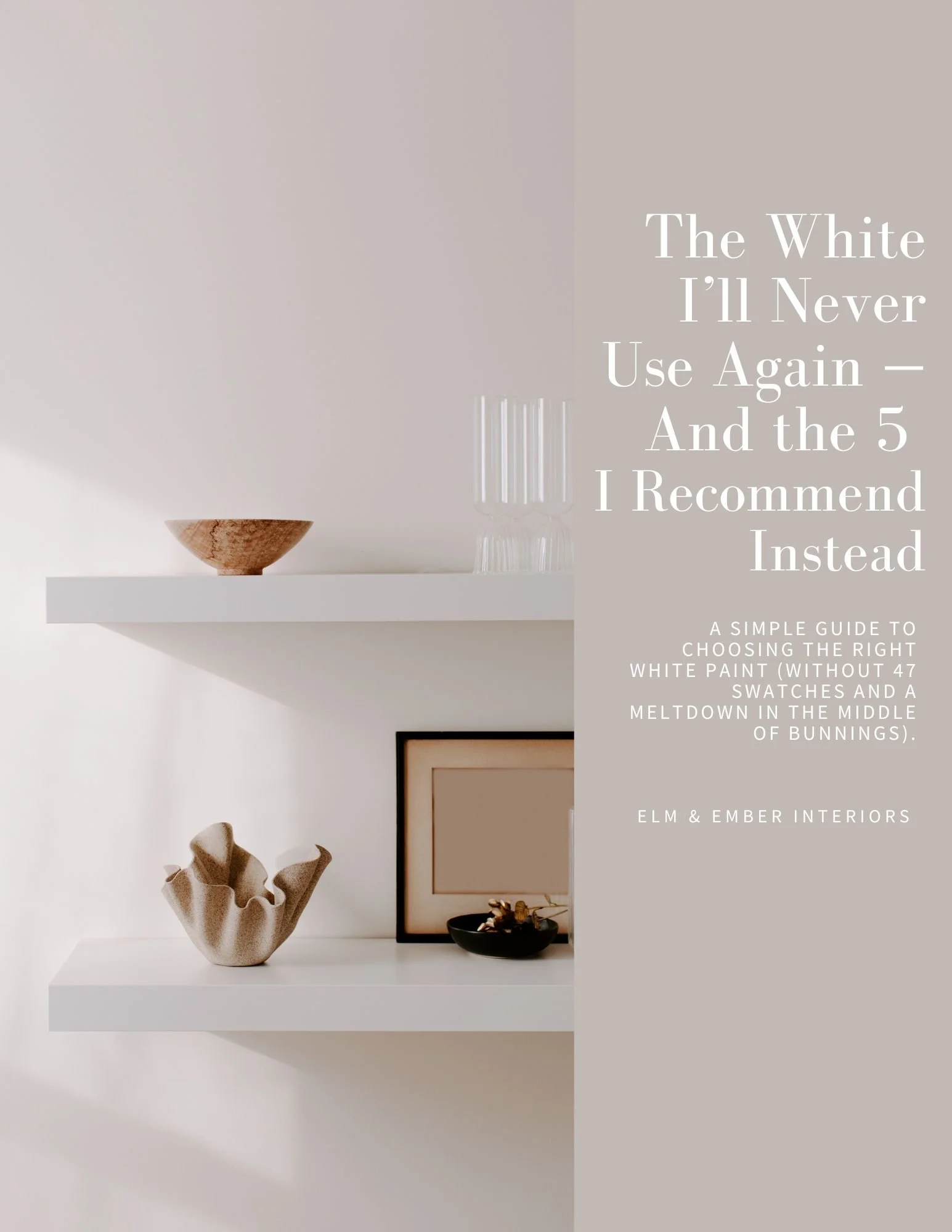
Choosing white paint shouldn’t feel this hard.
Download the 5 whites I actually use in real homes — and the one I avoid (because it turns blue).
A simple, designer-backed guide to help you avoid costly mistakes and choose with confidence.
If you’ve ever stood in front of a wall of “white” samples… you’ll get this.
You’ve saved inspiration.
You’ve picked up sample pots.
And somehow… it still doesn’t feel right.
Because white isn’t just white.
Undertones shift.
Lighting changes everything.
And what looked perfect in-store can feel completely wrong at home.
→ That’s where most people get stuck.
This is what I see all the time.
I’ve worked with homeowners across Sydney and the South Coast who thought they’d chosen the “safe” white…
Only to realise it turned blue, yellow, or flat once it was on every wall.
The issue isn’t that you’re bad at choosing.
→ It’s that no one shows you what to actually look for.
Inside the guide, you’ll get:
The 5 white paint colours I use most often in real homes
The one popular white I no longer recommend (and why)
Simple guidance on when each colour works — and when it doesn’t
How to avoid undertone mistakes that cost time and money
→ So you can stop guessing — and start choosing with confidence

Start with the guide — and take the guesswork out of it.
→ Still unsure after reading it?
→ Book a 1:1 Colour Consult and we’ll get it right — the first time.