
A real exterior colour consultation from the Macarthur region — showing exactly how strategic colour selection turns a clashing facade into a cohesive, modern classic.
Elm & Ember Interiors · Orangeville · Macarthur Region · NSW · 7 min read

If you have a red brick home — particularly one built in the late 1980s or 1990s — and you've started updating it piece by piece, you may already know this feeling. You made what seemed like a safe, sensible decision. New window frames. A clean, fresh white. And then they went in, and suddenly the brick looks redder than you've ever noticed it, the mortar looks beigeier, and the whole facade feels more discordant than it did before you started.
That is exactly where this project began.
A client in Orangeville — on the fringe of Cobbitty, Harrington Grove, and the broader Macarthur region — reached out to Elm & Ember Interiors after hitting this precise wall. They had updated their interior beautifully: crisp, contemporary finishes that felt calm and cohesive. They had also replaced several exterior window frames in white. And the result of that otherwise-reasonable decision was a facade that felt fractured — the white windows intensifying the warmth of the red brick and drawing harsh attention to the beige mortar in a way that felt anything but considered.
Rather than pressing on and hoping the next decision would resolve it, they stopped. They brought in a professional Exterior Colour & Material Selections before spending further money on trades, materials, and changes they might regret. That instinct — to pause and get expert direction before continuing — is exactly the right one.
“The most expensive colour mistake isn’t the one you make. It’s the one you keep building on top of.”
Understanding the Problem Before Choosing a Solution
When I begin any exterior colour consultation, I'm not looking for the prettiest palette on a colour fan deck. I'm looking for what the home is actually doing — what its existing elements are communicating, where the tension is, and what a new palette needs to resolve. In this case, there were three clear dynamics at play.
First, the undertone conflict. Red brick has a warm, orange-red undertone. Crisp, cool white — the most common window frame choice — has a blue or grey undertone. When those two undertones meet without a bridging element, they create visual tension rather than contrast. They fight instead of framing.
Second, the mortar problem. Beige mortar reads as a third colour in the facade composition, one that sits between the brick and the white without belonging fully to either. Without a considered palette, it amplifies the incoherence rather than settling into the background.
Third, the interior-to-exterior disconnect. The clients had cool blue-grey tones inside. The goal wasn't simply to fix the facade — it was to create a palette that felt like a logical continuation of the interior sensibility, so that the home reads as one cohesive thing inside and out.
With those three problems clearly defined, the solution followed a logic — not a guess.
The Colour Strategy: Working With the Brick, Not Against It
The most common instinct when confronted with a clashing brick facade is to try to disguise or diminish the brick. Render it. Paint it. Cover it. But on this Orangeville acreage property, the brick had genuine warmth and character — and it belonged to the landscape in a way that a render job would have erased. The right strategy was never to hide the brick. It was to build a palette around it that let it settle naturally into the overall composition.
Here is how each decision was made:

The roof is the single largest surface on the facade composition — it covers more visual area than any other element and sets the tonal key for everything below it. Windspray is a soft, mid-tone grey with a green undertone that references natural foliage. It is warm enough not to clash with the brick's red tones, cool enough to work with the blue-grey interior palette, and grounded enough to connect the home to the surrounding Orangeville landscape rather than sitting on top of it. It does not compete with the brick — it frames it.

Surfmist is what bridges the gap between the existing white window frames and the red brick — and it is the decision that resolves the entire problem. Where crisp white creates a harsh, high-contrast edge against brick, Surfmist is a warm, soft off-white with a barely-there green undertone that sits comfortably between the cool of the windows and the warmth of the brick. It doesn't eliminate the white frames — it softens the transition between them and everything else. Applied to fascias, windows, and rear pergola, Surfmist becomes the visual thread that ties the facade together. It is not exciting on a fan deck. On a brick home, it is transformative.

The interior of this home had a French provincial character — warm, layered, and tactile — and the front door needed to honour that while still belonging to the updated exterior. A painted door in any colour felt like the wrong answer. The home already had red brick introducing warmth, and adding another strong colour at the entry risked tipping the palette into busy. What the facade actually needed at that point was texture and natural material — something that referenced the acreage setting and connected the outside world to the interior personality of the home.
An American Oak timber door was the answer. The natural grain brings warmth without adding red, softness without adding another colour to manage, and a crafted quality that a painted surface simply cannot replicate. Against the Surfmist trim and Windspray roof, it reads as grounded and intentional — the kind of detail that makes a home feel considered rather than assembled. It also signals, immediately, that this is a custom home on a property with character. Which it is.
Beyond Paint: The Complete Material Palette
A truly cohesive exterior result requires more than choosing the right Colorbond and a paint code for the door. Colour is one layer — but material choice is equally important, and on this Orangeville property, there were several additional elements that needed to be specified to complete the transformation.
Pier Cladding Modern wall cladding for the front piers, chosen to complement the existing natural sandstone and create a textural bridge between the new trim palette and the original brick without requiring any structural alteration.
Porch Tiles Replacement tile selection for the front porch, retiring the original red stencil concrete in favour of a contemporary tone that grounds the entry and connects to the Surfmist trim palette above it.
External Lighting Contemporary exterior lighting specification to complement the updated facade — ensuring that the home reads as considered after dark as it does in daylight.
Decorative Detail Colours Exact colour direction for fretwork, posts, and any remaining decorative elements — so that every component of the facade belongs to the same considered palette.
Every one of these decisions was documented in a complete material and colour schedule — specific product names, colour codes, and application notes — so that trades could execute accurately without interpretation or guesswork.
Seeing It Before You Build: The 3D Visual Render
There is a moment in every exterior consultation where confidence either arrives or doesn't. For some clients, holding a colour card against a brick wall is enough. For most, it isn't — because the human eye cannot reliably extrapolate from a small swatch on a fan deck to a full facade in natural light, across all its surfaces and angles.
That is what a 3D visual facade render provides. For this Orangeville project, I produced a custom digital mockup of the complete facade — showing the Windspray roof, Surfmist trim, front door colour, new porch tiles, pier cladding, and lighting in situ, before a single trade was engaged or a tin of paint was opened.
Why the render matters commercially:
An exterior transformation of this scope — roof, gutters, fascias, eaves, door, porch tiles, cladding, lighting — represents a significant spend. Mistakes at that scale are not minor inconveniences. A 3D render is not a luxury add-on. It is insurance against committing that budget to the wrong outcome.
Seeing the design confirmed before anything is ordered or installed is how confident decisions get made. It is also, in this case, how the clients moved from hesitation and uncertainty to genuine excitement about their home — before the work had even begun.
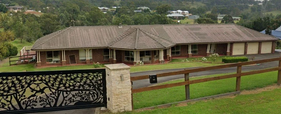
Before: Orangeville red brick home before renovation
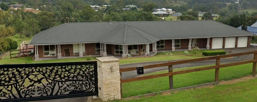
After: 3D Mockup of suggested Orangeville red brick home with Colorbond Windspray Roof & Surfmist fascia, windows and garages
The Result: A Modern Classic That Belongs to Its Landscape
No brick was touched. No render was applied. The structural envelope of the home remained entirely unchanged. What changed was the colour and material language layered across it — and that was enough to transform a facade that felt fractured and dated into one that feels cohesive, considered, and genuinely at home on an Orangeville acreage block.
The Windspray roof grounds the home in its landscape. The Surfmist trim resolves the undertone conflict and ties every element together. The deep green door gives the home a clear identity. The completed material palette ensures that every surface tells the same story.
This is what a professional exterior colour consultation delivers — not a colour suggestion, but a complete, considered strategy that accounts for every element in the facade composition and produces a result you can live with, confidently, for decades.
Two Ways to Work With Elm & Ember on Your Exterior
If this project resonates — whether you're in Harrington Grove, Cobbitty, Oran Park, Mount Annan, Camden, or anywhere in the Macarthur region or Greater Sydney — there are two ways to access this level of exterior colour direction, depending on where you are in your project and what you need.
Service 01
Exterior Colour & Materials Consultation
A full exterior colour consultation covering your complete facade — roof, render or brick, trim, door, and all secondary elements. This is not just limited to paint colours but includes other elements such as cladding selections, paving, tiling, and exterior lights etc. Every decision is considered as part of the whole composition, not specified in isolation. The service includes a custom photo render of your facade showing the complete proposed palette in situ, so you can see exactly what you're committing to before a single trade is engaged. Includes a complete colour and material schedule with exact product codes, ready for your painter and builder to execute. Available in-person across Sydney and NSW, or online via photo submission.
Service 02
Exterior Colour Consultation
A focused 30-minute paint-only consultation for homeowners who need confident direction on their exterior colour palette — render, brick, trim, eaves, gutters, and door colour. Includes a personalised paint colour schedule with exact product codes. Available in-person or online via photo submission. A photo render of your facade can be added for an additional charge if you'd like to see the palette confirmed before committing.
You can also purchase this exact Orangeville exterior colour palette directly — including all specified Colorbond and paint codes, material recommendations, and application notes — as a downloadable colour spec sheet from the Elm & Ember shop.
Don't spend another dollar on your exterior without a plan.
Exterior colour mistakes are visible every day and expensive to undo. A professional consultation is the clearest way to move forward with confidence — whether you're in Macarthur, the Sutherland Shire, the Southern Highlands, or anywhere across Sydney and NSW.
© Elm & Ember Interiors · Sydney & NSW · Exterior Colour Consultant