
The 5 Timeless Dulux Neutral Colours Designers Always Come Back To (Australia)
The Neutral Struggle
You’ve probably been there — standing at Bunnings, staring at rows of white and beige swatches, wondering why they all look the same. You take home ten samples, paint them on the wall, and… nothing feels right. Some look blue, others yellow, and suddenly you’re overwhelmed.
The truth? Not all neutral paint colours are equal. And when it comes to creating a timeless home in Australia, the right neutral can make or break your space.
After working as a colour consultant on homes across Sydney and the South Coast, these are the Dulux neutrals I return to again and again.
Why Neutrals Are So Tricky
Neutrals seem “safe,” but they’re actually the hardest to get right. Every neutral carries hidden undertones — cool, warm, or sometimes even pink or green. Add in Australia’s unique light (which shifts dramatically between a north-facing coastal home in Gerringong and a south-facing Highlands cottage in Bowral), and suddenly your “simple white” feels icy or dull.
Dulux has hundreds of whites and neutrals in their palette. Some are classics, while others are best avoided unless you know exactly what you’re doing. That’s why designers like me rely on a small group of tried-and-true shades that work across homes and styles.
The 5 Designer-Approved Neutrals
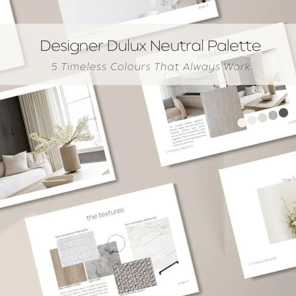
Over the years, I’ve noticed I return to the same five Dulux neutrals again and again. They’ve become my “quiet achievers” — versatile, timeless shades that balance well with timber floors, natural stone, and modern joinery.
These are the colours inside my 5 Timeless Neutrals Palette Pack. It’s a designer shortcut that saves you hours of second-guessing and hundreds of dollars in repainting mistakes. Each colour in the pack includes:
Where it works best (interior or exterior)
What it pairs beautifully with (flooring, cabinetry, stone)
A designer tip to help you use it with confidence
Prefer the designer shortcut?
Instead of standing in the paint aisle comparing swatches, I’ve created a simple 5 Timeless Neutrals Palette Pack that shows exactly how these colours work together.
Inside you'll find:
• the 5 designer-approved Dulux neutrals
• where each colour works best in a home
• pairing suggestions for flooring, cabinetry, and stone
• a moodboard showing how to layer these tones beautifully
It’s designed to save you hours of second-guessing — and potentially the cost of repainting an entire room.
How Designers Layer Neutral Paint Colours for a Calm, Cohesive Home
The secret to a calm, cohesive home isn’t choosing one paint colour — it’s creating flow. The best homes layer neutrals: a softer white for walls, a deeper tone for joinery, and a grounding shade in the flooring. This creates depth without feeling busy, and it’s the difference between “builder-basic” and a space that feels professionally curated.
In most homes, a successful neutral scheme includes three layers: a wall colour, a trim or joinery colour, and a grounding tone from flooring or cabinetry.
That’s exactly what the moodboard inside my palette pack shows you — how to mix and match these neutrals across your home for balance and longevity.
Once you’ve laid your foundation, take it a step further.
Need help choosing the right neutral for your home?
Every home has different lighting, flooring, and surrounding finishes. If you're feeling unsure, my Colour Consultations provide a clear plan so you can choose colours confidently.
Virtual consult: $250
In-home consult: $350
Together we'll create a palette that works beautifully with your home’s light, materials, and style.
Frequently Asked Questions About Dulux Neutral Paint Colours
Q: What is the most popular Dulux neutral in Australia?
A: Dulux Natural White is widely used, but it isn’t always the right fit. Depending on light and flooring, it can look too creamy or flat.
Q.What is the most popular Dulux neutral paint colour?
A. Dulux Natural White is one of the most widely used neutral paint colours in Australia because it balances warmth and brightness. However, the best neutral depends on your home's lighting, flooring and surrounding finishes.
Q.How do designers choose neutral paint colours?
A.Designers look at three key factors: natural light, undertones in flooring or stone, and how colours transition between rooms. The goal is to create a neutral palette that feels cohesive across the entire home.
Q.Do Dulux neutral colours work for exterior paint?
Yes, many Dulux neutrals work beautifully on exteriors. However outdoor light is much stronger than indoor light, so colours often appear lighter and cooler once applied.
Q: Which neutral white works best in south-facing rooms?
A: Generally, warmer neutrals help balance the cooler light. Testing samples is essential before you commit.
Q: Are Dulux neutrals good for exteriors too?
A: Absolutely — but outdoor light washes colours out. Always test in full sun and consider going 1–2 shades darker than you think.
Ready to simplify your paint choices?
You have two easy options:
$5 Designer Shortcut
Download my 5 Timeless Neutrals Palette Pack and skip the paint-shop overwhelm.
Personalised Guidance
Book a colour consultation and get a custom palette tailored to your home.
Deanna is the founder of Elm & Ember Interiors, a Sydney-based interior design studio that helps families create beautiful, practical homes. She specialises in colour consultations, interior design and selections support for new builds and renovations.