Struggling to find colours that actually work with your red brick?
If you’ve ever stood outside your home thinking:
→ Why does everything I pick look wrong?
→ Why does it suddenly look orange… or too dark?
→ How do I modernise this without ruining it?
You’re not imagining it.
✦ Red brick is one of the hardest exteriors to get right.
And most people don’t get it wrong because they chose a bad colour…
→ they get it wrong because the undertones aren’t working together.
THIS IS WHERE YOU STOP SECOND GUESSING
This palette was originally created for a real client with deep red brick —
to soften, modernise, and bring everything together without losing character.
Now it’s been refined into a ready-to-use exterior scheme you can apply to your own home.
Not just colours that “look nice”…
→ but a combination that actually works together.
WHAT THIS HELPS YOU DO
With this palette, you’ll:
✔ avoid colours that clash with your brick
✔ understand what actually works with deeper red tones
✔ create a cohesive, modern exterior
✔ feel confident before committing to paint
WHO THIS IS FOR
This palette is designed specifically for homes with brick that:
• leans burgundy rather than bright orange
• has charcoal, brown, or cooler undertones
• feels rich and deep rather than light or sandy
→ If your brick is lighter, orange or terracotta — this won’t give you the right result (I’m creating a separate palette for that)
WHAT YOU GET
Inside your exterior palette:
• Complete colour plan (roof, render, trims, garage + features)
• Visual sample board so you can see how it works together
• Painter-ready specification sheet
• Suggested material pairings (timber, stone, tiles, lighting)
→ So you’re not piecing this together yourself…
you’re working from a complete, considered scheme.
WHY THIS WORKS
This isn’t just a collection of colours.
Every element has been chosen to:
→ balance the depth of red brick
→ soften without washing it out
→ create contrast that feels intentional
→ give your home a modern, grounded look
This isn’t about picking colours.
It’s about:
✦ finally feeling confident in your exterior
✦ knowing everything works together
✦ and moving forward without second guessing
HOW TO USE
Use the palette exactly as designed…
or apply individual elements depending on your project.
(Painting trims, updating render, refreshing garage doors, etc.)
NOTES
Always test colours onsite before painting.
Lighting and surrounding materials will affect how colours appear.
Still not 100% sure this will work on your home?
This is exactly where most people get stuck.
Not because they don’t have good taste —
but because they’re trying to make a final decision without seeing how everything works together.
This palette was created to remove that.
→ It gives you a clear, proven direction
→ So you’re not second guessing every choice
→ Or wasting time (and money) on samples that don’t work
If you’re:
→ this is designed for you.
Want to be 100% certain before you paint?
➤ Book a Mini Colour Review ($49)
I’ll review your home and confirm whether this palette works
with your exact brick, lighting, and surroundings —
so you can move forward with confidence.
This isn’t about choosing colours
It’s about choosing how your home will feel
every time you pull into the driveway.
Download instantly and start seeing your home differently

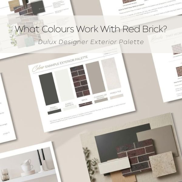 Image 1 of 4
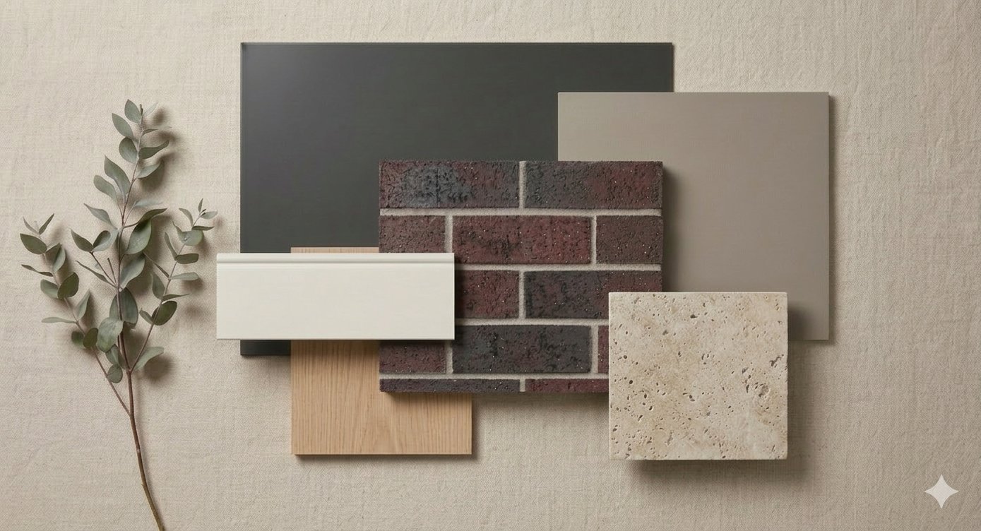 Image 2 of 4
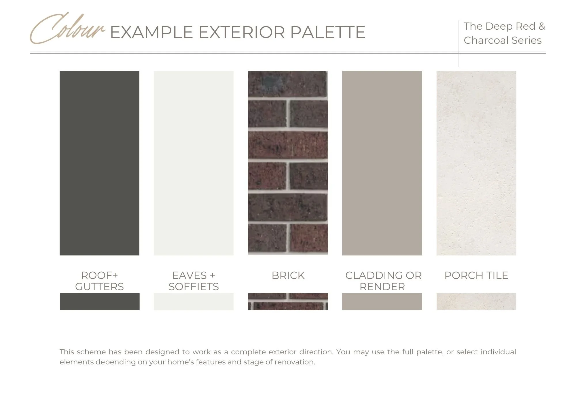 Image 3 of 4
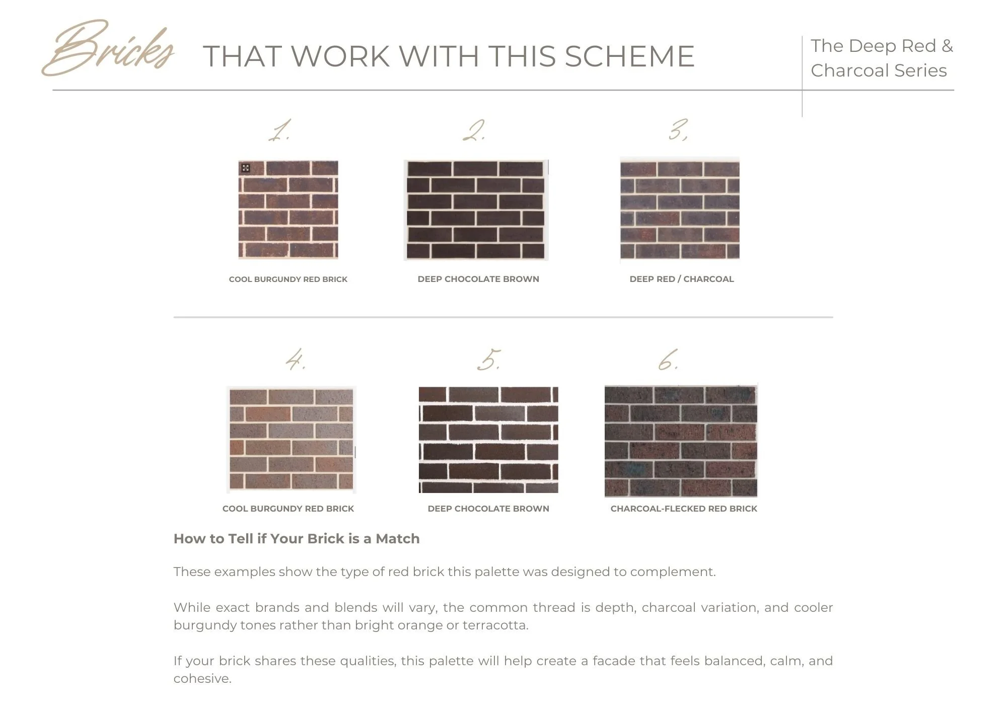 Image 4 of 4